Bingo!
Every New Year's Day, many of my family and friends gather to play bingo. In recent years there have been too many people in the house to hear what numbers have been called. bingo-board.org for anyone to set up a bingo board and provides a URL for "calling" the numbers, and one for watching the board.
Running on Google's App Engine, written using Django and django-nonrel. On top of Django is django-tastypie, which creates a REST interface for the application. On the frontend, Backbone.js, and CSS3.
GitHub: https://github.com/colinsullivan/bingo-board.
CSS3 Animations
Here is a video of the effects as they currently stand. You can see that when a number is called, it animates and then continues to animate until another is called.
What is happening is pretty awesome. Each "bingo marker" has a .disabled class initially:
.bingo_marker.disabled {
    opacity: 0.4;
    background: #BAB49D;
    border: none;
    -webkit-box-shadow: 0px 0px 0px rgba(0, 0, 0, 0.5);
}
If a marker has been called, it will have an .enabled class on it:
.bingo_marker.enabled {
    -webkit-animation-name: bounceEnable;
    -webkit-animation-duration: .25s;
    -webkit-box-shadow: 5px 5px 5px rgba(0, 0, 0, 0.5);
    background: -webkit-gradient(linear, 0% 0%, 0% 100%, from(#3D4C42), color-stop(0.3, #3D4C42), to(black));
    border: 1px solid white;
    opacity: 1;
}

@-webkit-keyframes 'bounceEnable' {
    from {
        -webkit-transform: scale(1);
        -webkit-animation-timing-function: ease-in-out;
    }
    33% {
        -webkit-transform: scale(1.5);
        -webkit-animation-timing-function: ease-in-out;

    }
    66% {
        -webkit-transform: scale(.75);
        -webkit-animation-timing-function: ease-in-out;
    }
    75% {
        -webkit-transform: scale(1.10);
        -webkit-animation-timing-function: ease-in-out;
    }
    to {
        -webkit-transform: scale(1);
        -webkit-animation-timing-function: ease-in-out;
    }
}
The animation here is the quick initial bounce when a number is activated (most visible above when a marker turns from red to black). This is achieved by a simple keyframe animation on the scale attribute of the element. Before I discovered scale, I tried animating all of the attributes including font-size a while back which didn't work out so well.
The last animation that is visible in the video is the long, repeating bounce for whichever marker is the last enabled. For this, like all of the above animations, I just add a class, lastEnabled:
.bingo_marker.lastEnabled {
    background: -webkit-gradient(
        linear, 0% 100%, 0% 0%,
        from(#FF0000),
        color-stop(0.4, #FF0000),
        to(#FF7D7F));
    -webkit-animation-name: lastEnabled;
    -webkit-animation-duration: 2.25s;
    -webkit-animation-direction: normal;
    -webkit-animation-iteration-count: infinite;
    z-index: 102;
}

@-webkit-keyframes 'lastEnabled' {
    from {
        -webkit-transform: scale(1);
    }
    10% {
        -webkit-transform: scale(1.5);

    }
    20% {
        -webkit-transform: scale(.75);
    }
    30% {
        -webkit-transform: scale(1.30);
    }
    to {
        -webkit-transform: scale(1);
    }
}
As you can see, this class merely changes the color of the marker and begins a repeating animation, once again on the scale attribute.
Another animation that I experimented with, but ended up removing, was the following:
This effect was quite fun to figure out how to achieve, although it may not look all that pleasing. I wanted to figure out how to move that "caution tape" looking background without using any images. In order to create the "caution tape" look, I wrote a little SVG that generates these diagonal stripes:
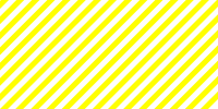
<svg xmlns="http://www.w3.org/2000/svg" width="200" height="100">
  <g style="fill-opacity:1;fill: #FFFF00;" transform="rotate(-45 50 50)">
    <rect x="-50%" y="-20%" height="5%" width="150%" />
    <rect x="-50%" y="-10%" height="5%" width="150%"/>
    <rect x="-50%" y="0" height="5%" width="150%"/>
    <rect x="-50%" y="10%" height="5%" width="150%"/>
    <rect x="-50%" y="20%" height="5%" width="150%"/>
    <rect x="-50%" y="30%" height="5%" width="150%"/>
    <rect x="-50%" y="40%" height="5%" width="150%"/>
    <rect x="-50%" y="50%" height="5%" width="150%"/>
    <rect x="-50%" y="60%" height="5%" width="150%"/>
    <rect x="-50%" y="70%" height="5%" width="150%"/>
    <rect x="-50%" y="80%" height="5%" width="150%"/>
    <rect x="-50%" y="90%" height="5%" width="150%"/>
    <rect x="-50%" y="100%" height="5%" width="150%"/>
    <rect x="-50%" y="110%" height="5%" width="150%"/>
    <rect x="-50%" y="120%" height="5%" width="150%"/>
    <rect x="-50%" y="130%" height="5%" width="150%"/>
    <rect x="-50%" y="140%" height="5%" width="150%"/>
    <rect x="-50%" y="150%" height="5%" width="150%"/>
    <rect x="-50%" y="160%" height="5%" width="150%"/>
    <rect x="-50%" y="170%" height="5%" width="150%"/>
    <rect x="-50%" y="180%" height="5%" width="150%"/>
  </g>
</svg>
These stripes are then loaded into that "background" element as the background-image:
#last_enabled_background {
    background: black;
    background-image: url(../svg/stripes.svg);
    background-repeat: repeat;
    ...
}
Since the bars are already at a diagonal, all I need to do now is move them continuously:
#last_enabled_background {
    -webkit-animation-name: moveBorder;
    -webkit-animation-duration: 10s;
    -webkit-animation-timing-function: linear;
    -webkit-animation-iteration-count: infinite;
    -webkit-box-shadow: 5px 5px 5px rgba(0, 0, 0, 0.5);
}
@-webkit-keyframes 'moveBorder' {
    from {
        background-position: 0% 0%;
    }
    50% {
        background-position: 100% 0%;
    }
    to {
        background-position: 0% 0%;
    }
}